PreSENTATION WORKs
So much of my work in this category has been proprietary or under NDA and can't be shown.
But here are things I can show...
PDF Downloadable Samples & Presentations
(Downloadable PDF)
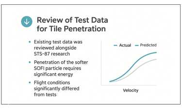
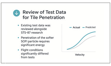
Media Influence on Customer Conversion
A full-funnel framework for understanding exposure, sequencing, & lag.
Translating Marketing Data into Strategic Insight
With this anonymized presentation my role was to transform a complex operational challenge into a visual framework that allows leadership teams to evaluate risk, governance, and execution structure at a glance.
Large organizations regularly face major operational transitions — acquisitions, outsourcing shifts, system migrations, and organizational restructures. These initiatives rarely fail because of execution alone. More often, they fail because the coordination structure behind the transition is unclear.
In this project, the challenge was to translate a complex operational problem into a clear decision framework executives could understand quickly.
The core issue is a structural contradiction that appears in nearly every large transition: teams need broad participation across the organization, but they also require centralized coordination to prevent fragmentation. Treating this as a choice between decentralization and control often leads to delays, missed dependencies, and late risk discovery.
To resolve this, the presentation introduces a systems model for managing enterprise transitions at scale.
The framework separates three critical layers of the transition process:
• Central Transition Framework
– governance, sequencing, and risk control
• Shared Visibility Layer
– cross-team dependency tracking and system awareness
• Distributed Workstreams
– operational execution aligned to business domains
This structure allows execution to remain close to the teams doing the work while maintaining the visibility and accountability leadership requires to manage systemic risk.
The presentation then walks leaders through the transition lifecycle, outlining how organizations move from mobilization to stabilization while maintaining operational continuity.
By translating an abstract coordination problem into a visual operating model, the narrative enables leaders to understand:
• where decision rights should sit
• how risks surface early
• how independent teams can move in parallel without losing alignment
This type of framework presentation is commonly used in executive briefings and transformation programs where leadership teams must quickly align around how a complex change effort will actually function.
The goal was not simply to present information, but to create a shared mental model leaders could use to guide execution.
(Downloadable PDF)
Structuring Complex Operational Change
for Executive Decision-Making
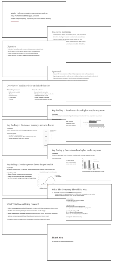
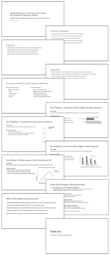
My role in this anonymized analysis was to structure complex market data into a clear visual narrative and designed the presentation framework used to communicate the findings to executive audiences.
This example examines how online media exposure relates to site behavior, revisits, and downstream conversion.
Marketing teams collect large amounts of media and behavioral data, but leadership teams often struggle to translate that information into clear strategic decisions.
This project focused on identifying patterns in how media exposure influences customer behavior across the digital journey. The objective was not simply to report data, but to uncover the behavioral signals that indicate how media actually contributes to conversion.
The analysis examined how different media formats — including display advertising, sponsored search, organic search, and referrals — correlate with key customer actions such as site visits, quote requests, and completed purchases.
Rather than treating these interactions as isolated events, the presentation analyzes the full customer journey, highlighting how engagement patterns evolve across multiple touchpoints.
Several important insights emerged from the analysis:
• Customers who ultimately convert tend to experience
higher levels of media exposure across multiple formats.
• Customer journeys are rarely linear; most include
repeated visits and revisits before conversion occurs.
• Media influence often extends beyond the initial interaction, with
observable increases in site activity two to three days
after exposure.
These patterns suggest that effective media strategies should focus less on single interactions and more on coordinated cross-channel engagement over time.
Based on these findings, the presentation outlines several strategic actions for leadership:
• strengthen full-funnel engagement across media channels
• coordinate paid and organic media efforts
• design campaigns around non-linear customer journeys
• optimize pacing to capture delayed engagement effects
The goal of the presentation was to transform a complex dataset into a clear decision narrative that helps marketing leaders understand how media exposure contributes to downstream customer behavior.
This type of insight communication is commonly used in executive briefings where leadership teams must evaluate how marketing investment translates into measurable customer outcomes.
(Downloadable PDF)
(Downloadable PDF)
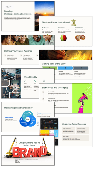
How Brand Strategy Becomes Operational
Many organizations struggle not with creating a brand, but with communicating it consistently across teams, channels, and customer touchpoints.
In this project, the objective was to develop a clear visual framework for explaining how brand systems actually function inside an organization.
Rather than presenting branding as a collection of visual assets, the narrative reframes it as an operational system composed of three interconnected components:
• Brand Identity — the visual language
• Brand Values — the strategic foundation
• Brand Personality — the communication style
From there, the presentation guides leaders through the practical mechanics of building and sustaining a brand:
• defining the target audience
• structuring brand storytelling
• aligning messaging and voice
• enforcing consistency through guidelines and training
• measuring long-term brand equity
The goal was not simply to explain branding, but to give leadership teams a structured way to think about brand as a strategic asset rather than a design exercise.
This type of framework presentation is commonly used in workshops and executive briefings where non-design stakeholders need a clear model for understanding how brand systems operate.
(Downloadable PDF)
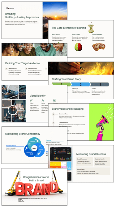
Explaining Enterprise AI Risk for Executive Decision-Making
Organizations adopting artificial intelligence face a new structural challenge: AI systems create pathways for enterprise data to move between users, applications, models, and external services in ways that traditional governance frameworks were never designed to control.
This presentation demonstrates how complex technical environments can be translated into clear operational frameworks for leadership audiences. The narrative explains how enterprise data flows through AI systems, identifies where exposure risks actually occur, and outlines how governance structures must adapt to manage those risks effectively.
Rather than focusing on model internals, the presentation reframes AI risk as a systems interaction problem—one that emerges at the boundaries where employees, AI interfaces, enterprise data sources, and third-party services intersect. The deck introduces a layered risk model that highlights where controls must exist across the enterprise technology stack.
The presentation concludes with a governance decision framework that helps leadership teams evaluate different AI access models—restrictive, open, and controlled—and determine how organizations can enable innovation while maintaining enforceable data protection policies.
This type of executive briefing is typical of the work required when technical teams must communicate complex architecture, risk, and governance considerations to senior leadership responsible for enterprise policy and operational strategy.
Context
Organizations were rapidly adopting generative AI tools, creating uncertainty around data exposure, governance, and regulatory compliance. Leadership needed a clear way to evaluate the risks before defining enterprise AI policy.
Outcome
The presentation organized technical, operational, and policy risks into a structured framework that supported executive discussion about acceptable AI use.
My Role
Designed the visual structure and narrative framework used to communicate the risk model to executive audiences.
Context
Leadership needed a structured narrative to explain a multi-phase operational consolidation so stakeholders could understand what was changing, why it mattered, and how the transition would unfold.
Outcome
The resulting presentation gave executives a clear, repeatable way to communicate the transition plan across teams.
Context
Marketing leadership needed a clear way to translate complex market and customer data into insights executives could quickly understand and act on.
Outcome
The resulting visual framework clarified key drivers of customer behavior and supported more informed decisions about messaging and channel strategy.
Context
Client needed a clear framework to explain how brand positioning, messaging, and customer experience should align across marketing channels and internal teams.
Outcome
The framework created a shared understanding of how brand strategy translates into consistent messaging and communication across the organization.
My Role
Designed the visual framework and presentation structure used to communicate the brand strategy to executive and marketing stakeholders.
Strategic Communication Case
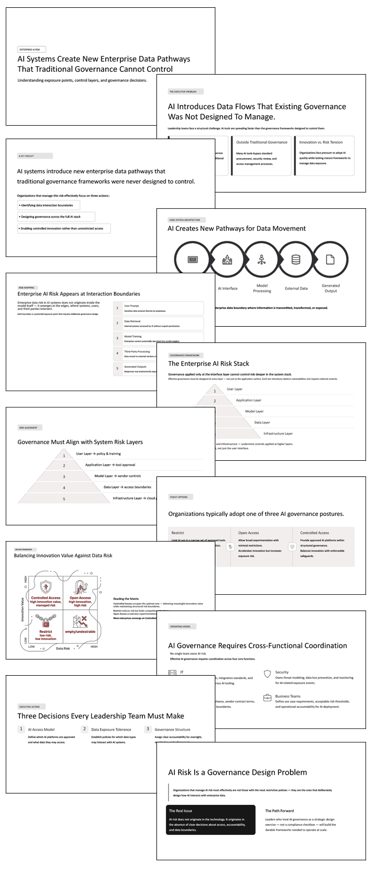
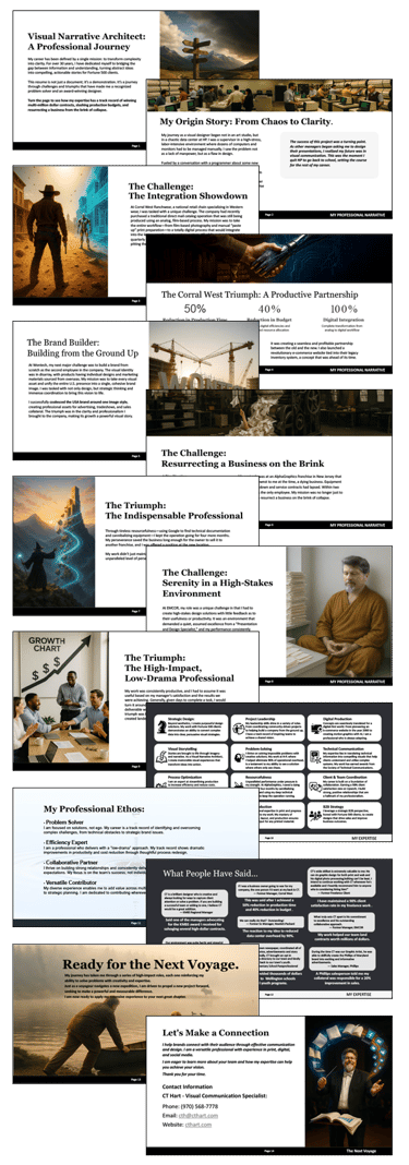
Telling a Professional Story
Context
I built this presentation to explain my professional path in a way that’s clearer and more engaging than a résumé.
Outcome
The narrative structure helps audiences quickly understand the experiences that shaped how I approach complex communication problems.
My Role
Narrative development and presentation design.
The Story Behind the Work
A résumé lists positions and timelines. It rarely explains how a career actually develops.
Over the years I’ve worked in technical illustration, print design, production environments, enterprise presentations, and executive communications. Every stage added another piece to the same puzzle: how to take complicated ideas and make them understandable to the people who need to act on them.
This presentation organizes that path into a simple narrative. It traces how early technical work led to broader communication roles and eventually to the work I enjoy most today—helping organizations translate complex systems, data, and strategies into clear visual stories.
Like the other presentations on this site, the subject isn’t just the content. It’s the structure. The deck demonstrates the same narrative approach I use when explaining technology, organizational change, market dynamics, or strategy.
In this case, the system being explained just happens to be much of my own professional path.
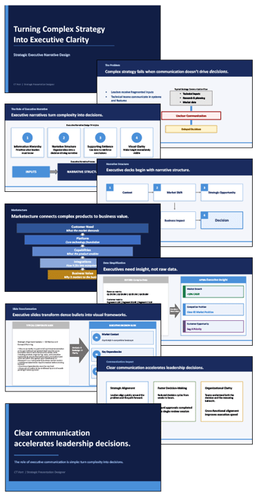
Context
Executive teams regularly make high-stakes decisions based on complex information: strategy, market dynamics, product architecture, financial performance, and operational constraints. Yet the materials used to communicate that information are often dense, fragmented, and difficult to interpret quickly.
In many organizations, presentations evolve as collections of slides rather than as structured narratives. Analysts contribute data, product teams contribute technical context, and leadership teams receive decks that contain the right information but lack a clear decision path.
This example presentation illustrates how structured narrative design transforms complex information into decision-ready communication. It demonstrates the methods used to clarify strategy, simplify data, and guide leadership audiences toward actionable conclusions.
My Role
My role in projects like this is to serve as the bridge between complex subject matter and executive decision-making.
Working with subject-matter experts, product leaders, analysts, and senior stakeholders, I translate complex material into clear narrative structures and visual frameworks that executives can quickly understand.
That work typically involves:
• Identifying the core decision the presentation must support
• Structuring the narrative so the audience moves logically from context to conclusion
• Simplifying dense analysis into clear insights
• Designing visual frameworks that communicate structure and hierarchy at a glance
• Ensuring each slide delivers a single decisive message
The result is not simply a better-looking presentation, but a communication tool that helps leadership teams align quickly and act with confidence.
Outcome
When complex information is presented with clear narrative structure and visual hierarchy, leadership teams spend less time interpreting slides and more time discussing strategy.
In practice, this approach typically leads to:
• Faster decision cycles
• Clearer alignment across leadership teams
• More effective communication of strategy across the organization
The presentation below illustrates the principles and methods used to achieve that outcome.
(Downloadable PDF)
Executive Communication Framework
Structuring complex analysis into clear leadership narratives.
Transforming Information into Decision-Ready Insight
The presentation begins by establishing the central problem: complex strategies often fail when communication does not translate complexity into decisions. Organizations frequently possess the right analysis and insights, but the way that information is communicated makes it difficult for leaders to quickly understand the implications.
The first section introduces the core principles of executive communication. Effective presentations prioritize information hierarchy, narrative structure, supporting evidence, and visual clarity. Together, these elements ensure that leaders see the most important information first and understand how supporting data reinforces the conclusion.
The presentation then demonstrates how executive decks are built through structured storyboarding. Rather than assembling slides independently, effective presentations follow a logical narrative sequence: establishing context, identifying market shifts, highlighting strategic opportunities, outlining the response, demonstrating business impact, and clearly defining the decision required.
Next, the presentation introduces the concept of marketecture, a visual framework used to explain complex products or systems in terms of the business value they deliver. By connecting customer needs, technology platforms, capabilities, integrations, and outcomes, this structure helps leadership audiences understand how technical complexity ultimately supports strategic goals.
The following section addresses one of the most common communication challenges in organizations: the gap between raw data and executive insight. Rather than presenting large volumes of metrics, effective communication extracts the meaning behind the data and presents leaders with clear conclusions they can act upon.
The presentation then demonstrates a practical transformation example. A typical dense corporate slide filled with bullet points is restructured into a concise executive framework that highlights market context, key dependencies, and the decision required. This illustrates how thoughtful narrative design can convert complex analysis into decision-ready communication.
Finally, the presentation concludes by showing the broader impact of clear executive communication. When information is structured effectively, leadership teams align more quickly, decisions are made faster, and organizations execute strategy with greater clarity.
The overarching goal of this work is simple: to turn complex information into communication that helps leaders make better decisions.

Before and After
Demonstrations of slide logic & how I handle slide issues
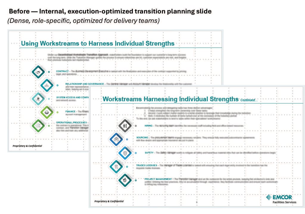
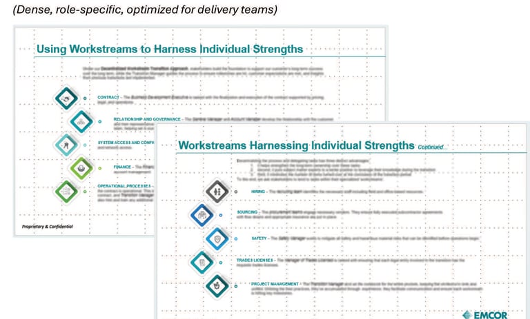
Audience dependent simplification:
C-Level Execs don't need a detailed breakdown to
understand the general structure and meaning.
#4) Visual Hierarchy
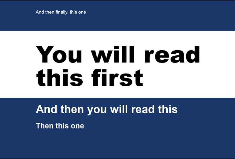

"Your eyes follow the rules, whether the text follows them or not.
When Fruit Goes Bad
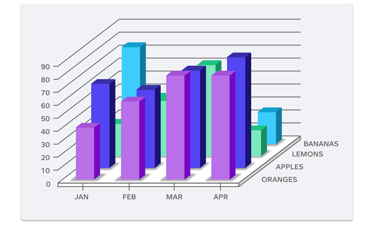
3D bars distort values — hard to compare, unclear true heights.
Overlapping bars cause visual clutter and hide data.
Too many colors with no legend; color meanings unclear.
Tilted perspective makes the axis labels and bars harder to read.
Category labels placed far from data, increasing cognitive load.
Unnecessary gridlines and depth lines create noise.
No clear title or takeaway, so the viewer must decode the chart.
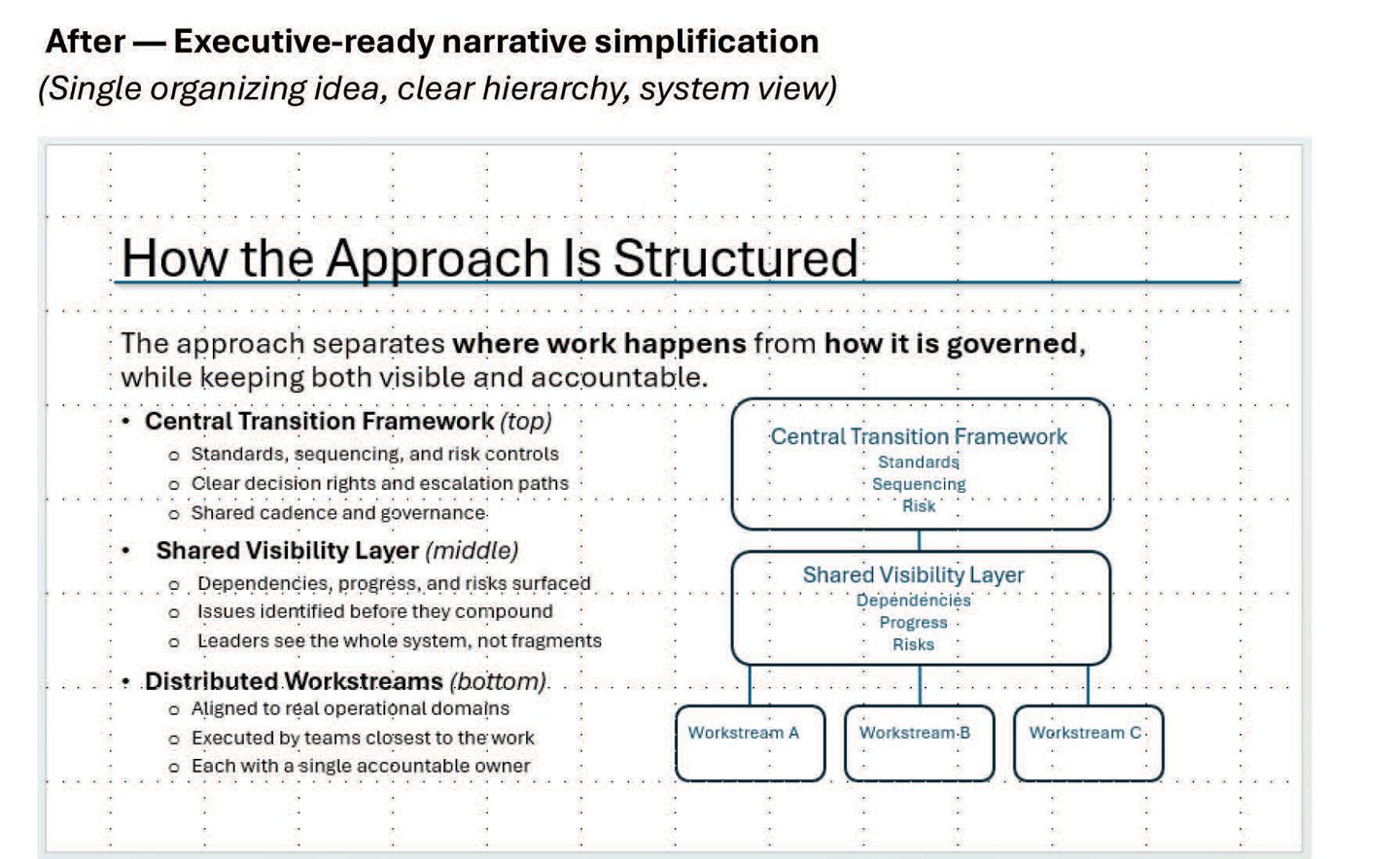
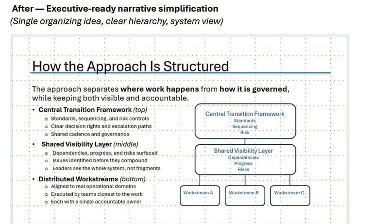
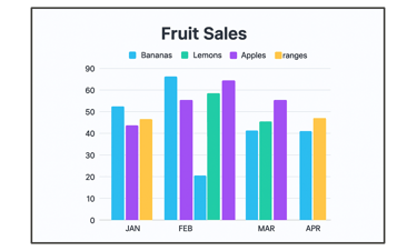
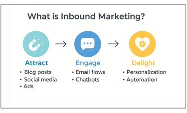
A Solution:
Simplification is Still the Key...
...and Sometimes Audience Dependent


Generic
Exec
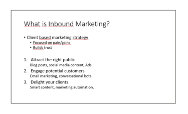
Too many bullets competing for attention (primary bullets + sub-bullets + numbered list).
Redundant structure — you have bullets AND numbers trying to do the same job.
No hierarchy — everything is the same weight, so nothing feels “most important.”
No visual anchor — no icon, illustration, or shape to help the brain categorize information.
No whitespace strategy — everything sits in one column of text, creating a dense block.
Underlines create visual noise — especially when they’re not links.
Not scannable — your eyes don’t know where to land.
A Solution:
Simplification has Power
It Makes the Message Clearer
Bullet Points Shoot Down the Message
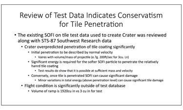
Data Density without Design Clarity
Too much text – essentially a paragraph with bullet points instead of sentences.
Redundant nesting – bullets within bullets make it unclear what’s most important.
No visual hierarchy – everything’s the same font size and weight, so the key message gets lost.
No visuals or charts – data and relationships are described in words instead of shown.
Typographical errors – “Vaires,” “hanrd,” etc., signal rushed or unpolished communication.
Weak scannability – a slide like this overwhelms instead of reinforcing the speaker’s point.
The Solution:
Simplification to create clarity
And there's often more than one solution...